
— What I’ve aspired to design, according to my creativity, expertise and style, is the human touch.
I am Darius Wenzeck and my role in the Jungle Party, spanned branding, graphic design, web design, and production of both print and digital assets.
My visual vision was to create a cohesive identity that balances the vibrancy of psychedelic universe with a clear, humanistic design language.
— Avoiding digital outsourcing or any ai assistance, and with a deep focus towards people and consciousness.
For Humans, By Humans!
This is my journey:
Branding
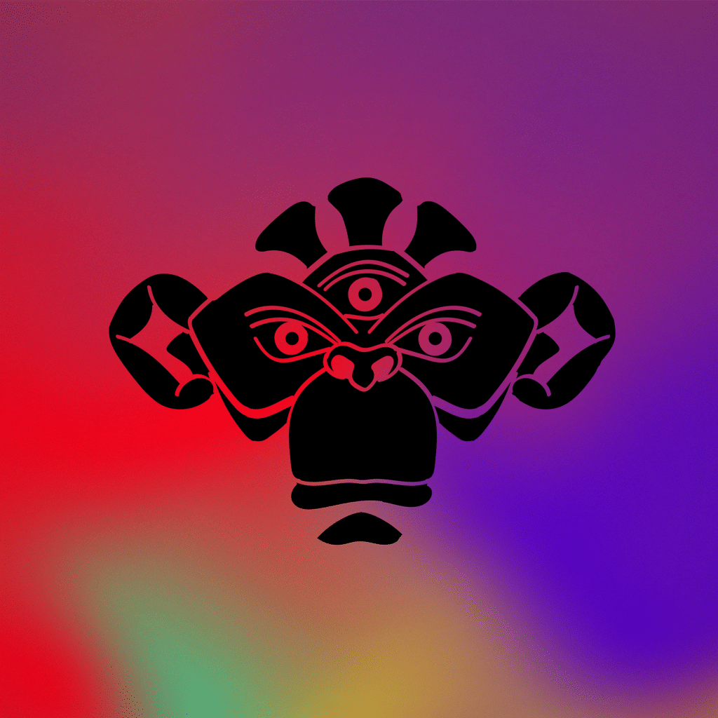
1. Logo Symbol
At its core, The Jungle Party is a Non Profit, Multidisciplinary Conference for Psychedelic Studies.
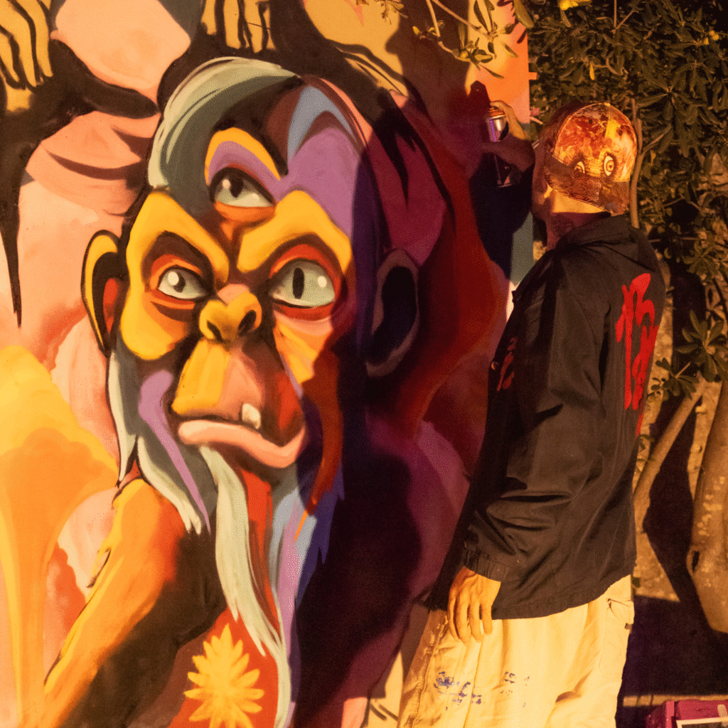
After the preliminary brief given by the team, the following were established: A three eyed Ape portrait, representing The Stoned Ape Theory.
This, in a nutshell, is the idea that our impressive cognitive capabilities, like affinities for art and language; self-awareness; and an understanding of science and even culture — all trace back to an encounter (accidental or deliberate) between early hominids and magic mushrooms.
Other Words defining the Symbol: consciousness, tribal, shaman, psychedelic, wise, mystique, love, joy, community, timeless, representative, custom.
Phase 1 – Research- in the Graffiti world for inspiration for the 3 Eyed Ape Symbol.
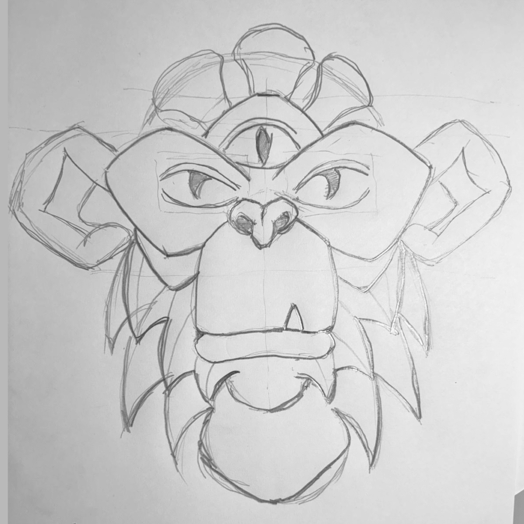
Phase 2 – pen and paper – draw the ape portrait. Things to keep in mind:
The shape needs to be understandable in a variety of sizes (not too many details).
Preliminary observations following the drawing: if consciousness appears to have a physical interpretation:
a. No petruding teeth, consciousness isn’t violent,
b. no vertical, raptor eyes, instead direct human gaze.
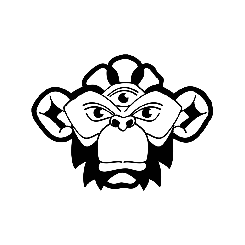
Phase 3 – Illustrator Draw – used for vector inking and editing. Observations after vector symbol v1:
a. Reduce the cartoonish look,
b. no beard to denote wise and elderliness, consciousness resides outside out perception over the flow of time.
Phase 4 – Illustrator – vector symbol v2. Reduced even more the details, the ape face at reduces size appears as a shamanic totem.
Branding
2. Wordmark
Jungle Party’, the brands name, in a neutral extended black font face, adding the descriptor ‘A Psychedelic Conference’’.
Branding
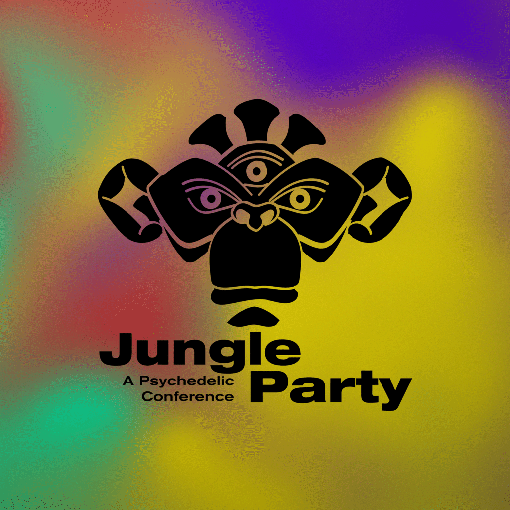
3. Combinations
The logo can be displayed:
a. Only Symbol
b. Only Wordmark
c. Horizontal Combination
d. Main Combination


Branding
4. Color Palette
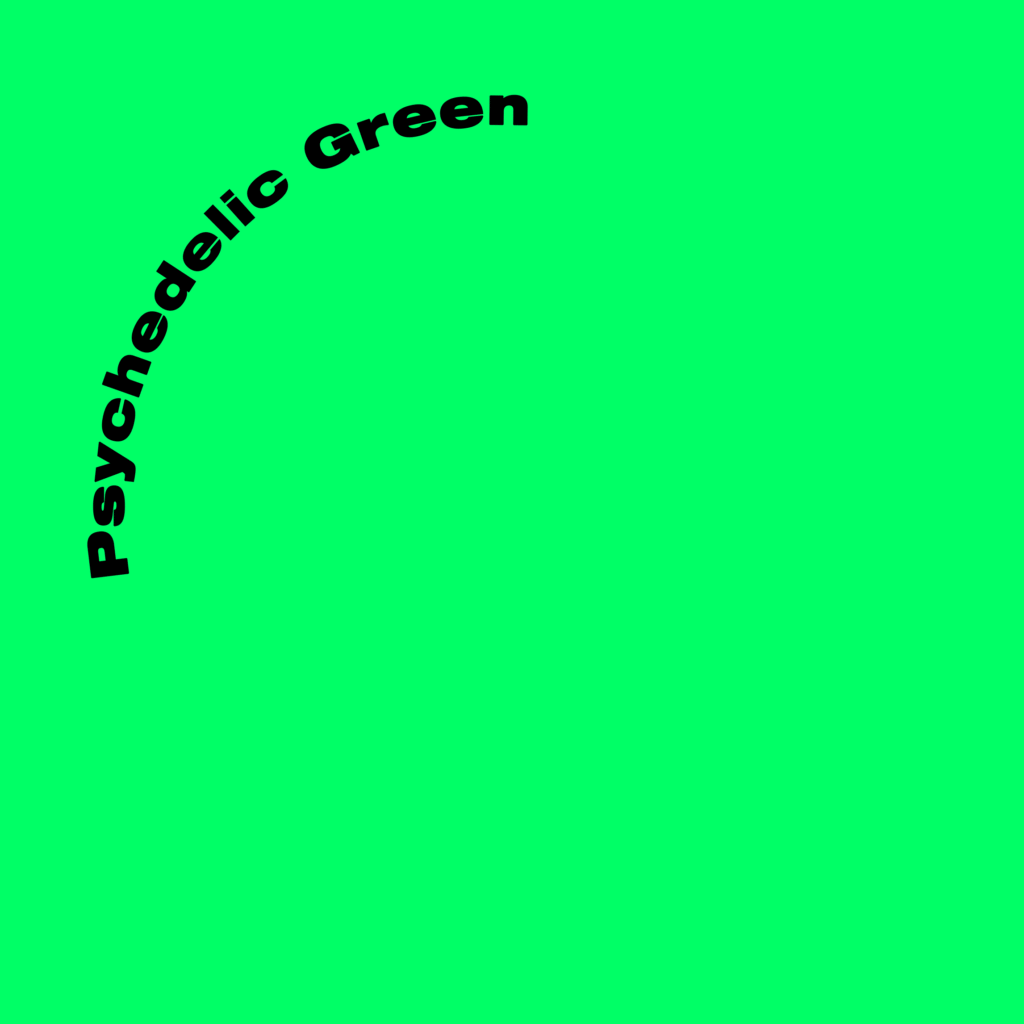
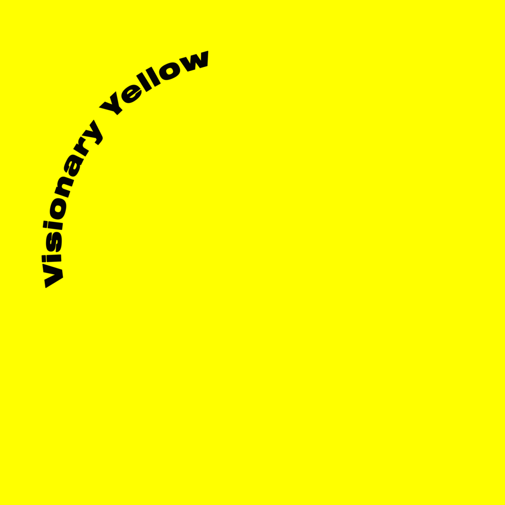
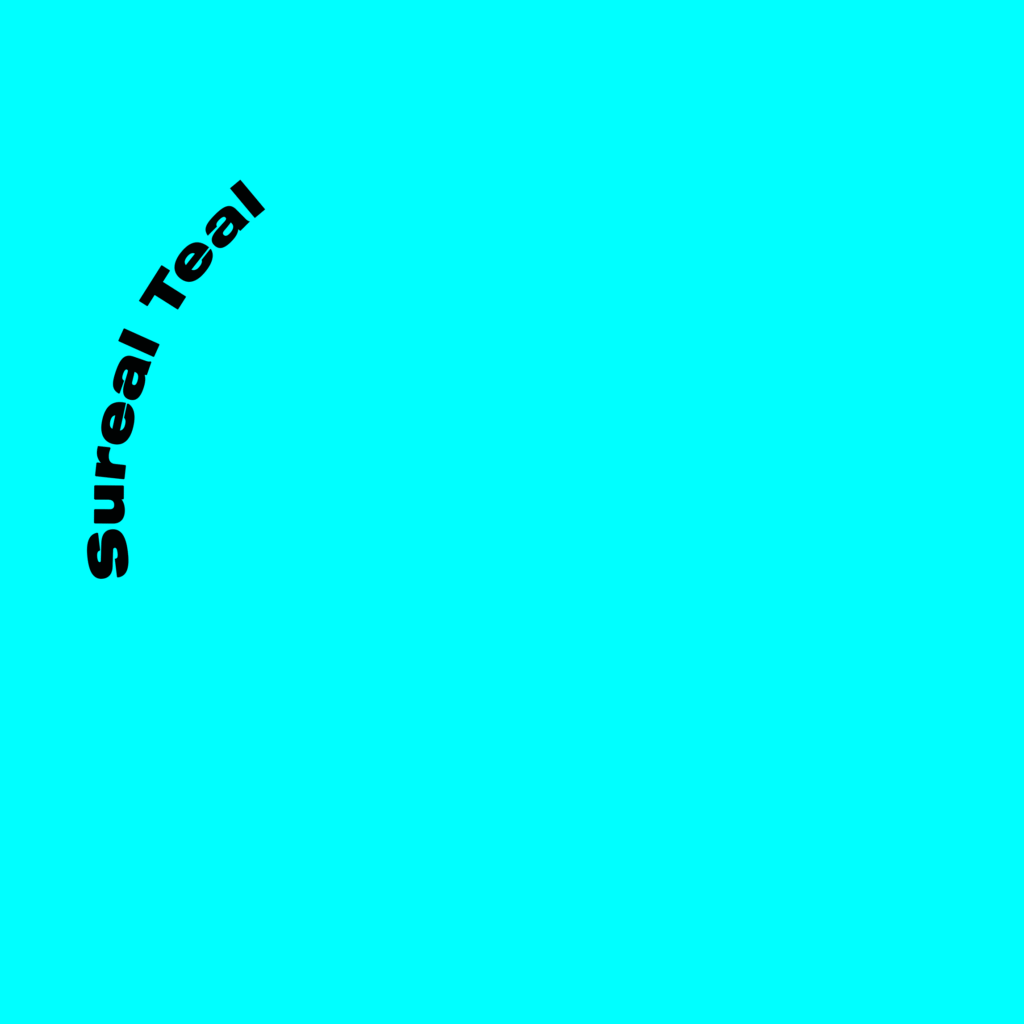
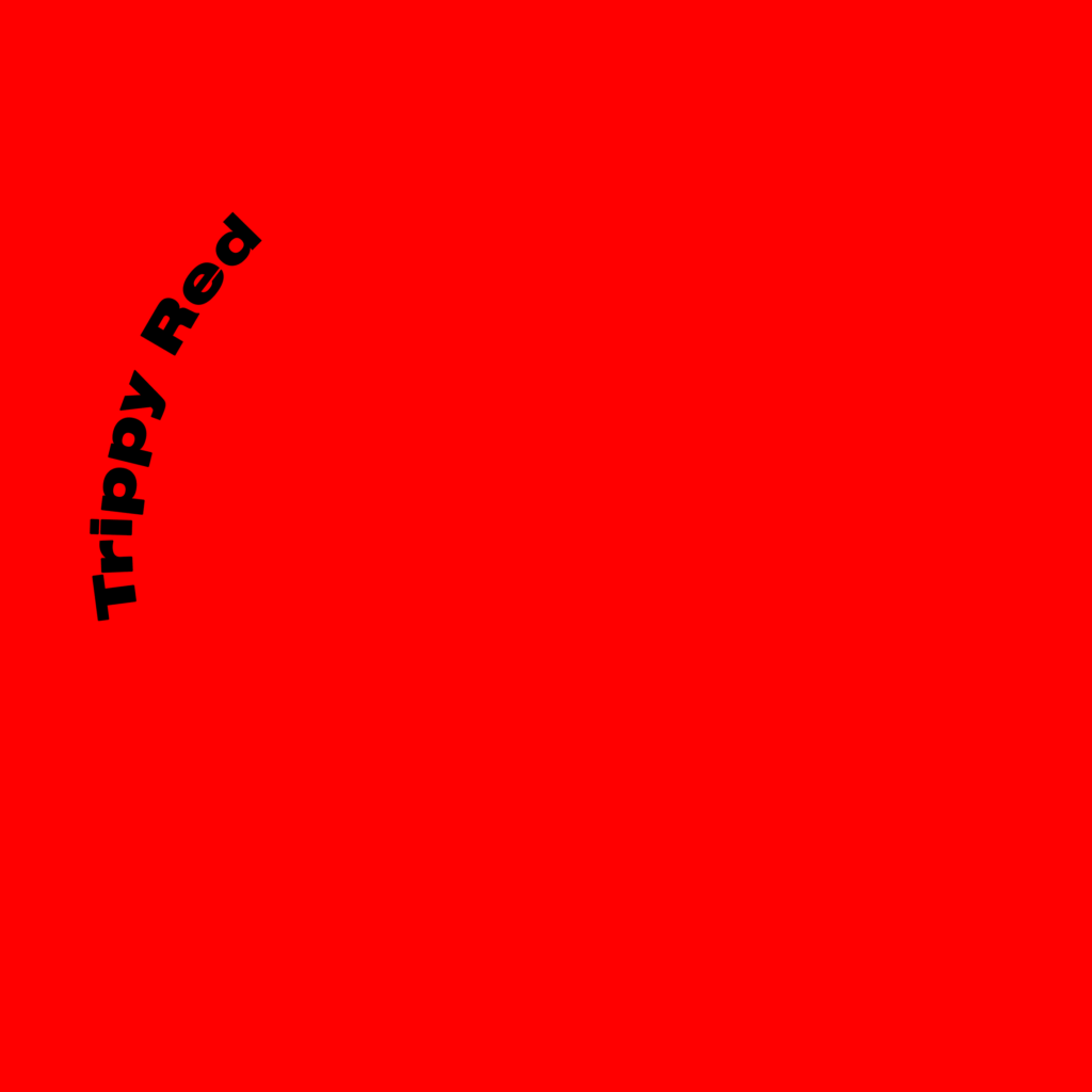
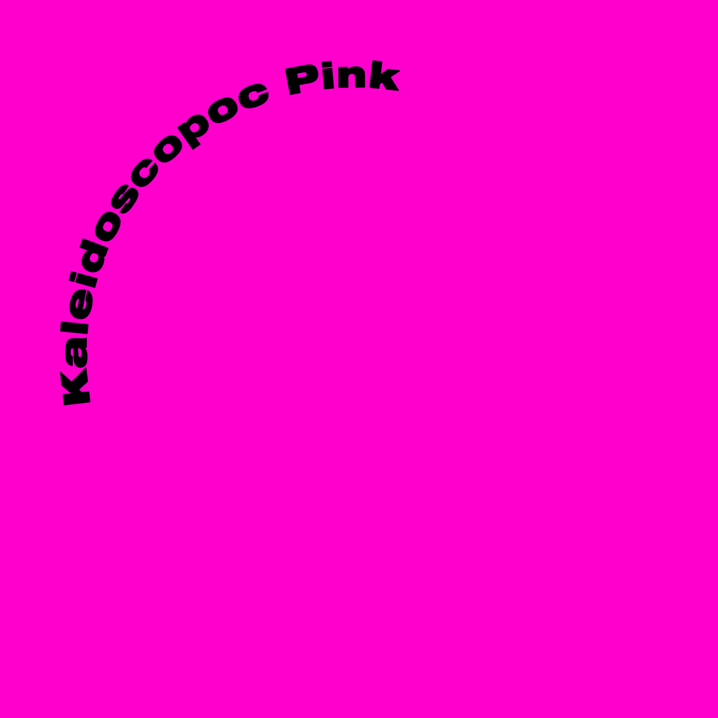
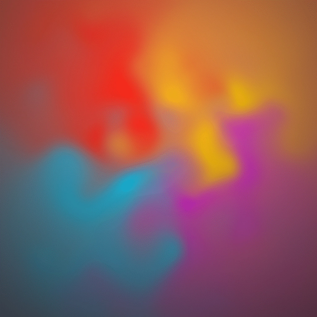
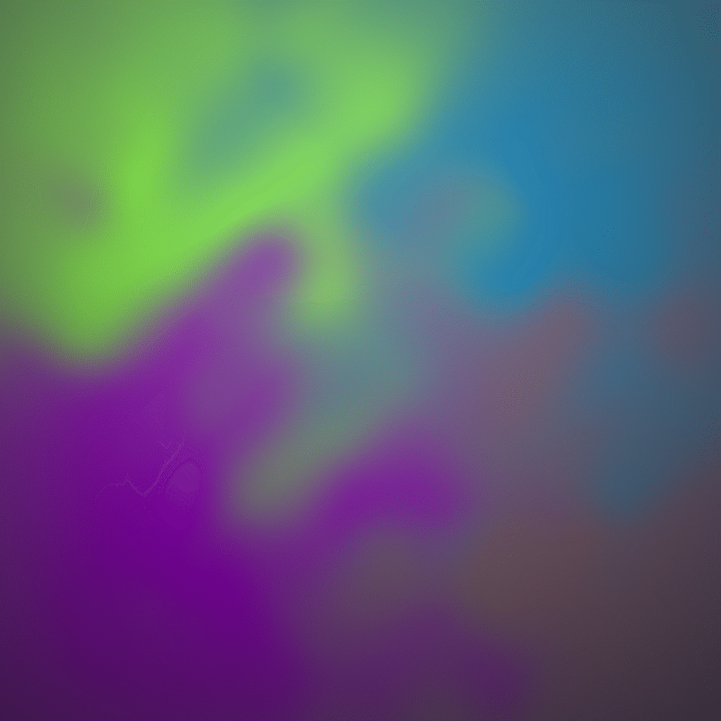
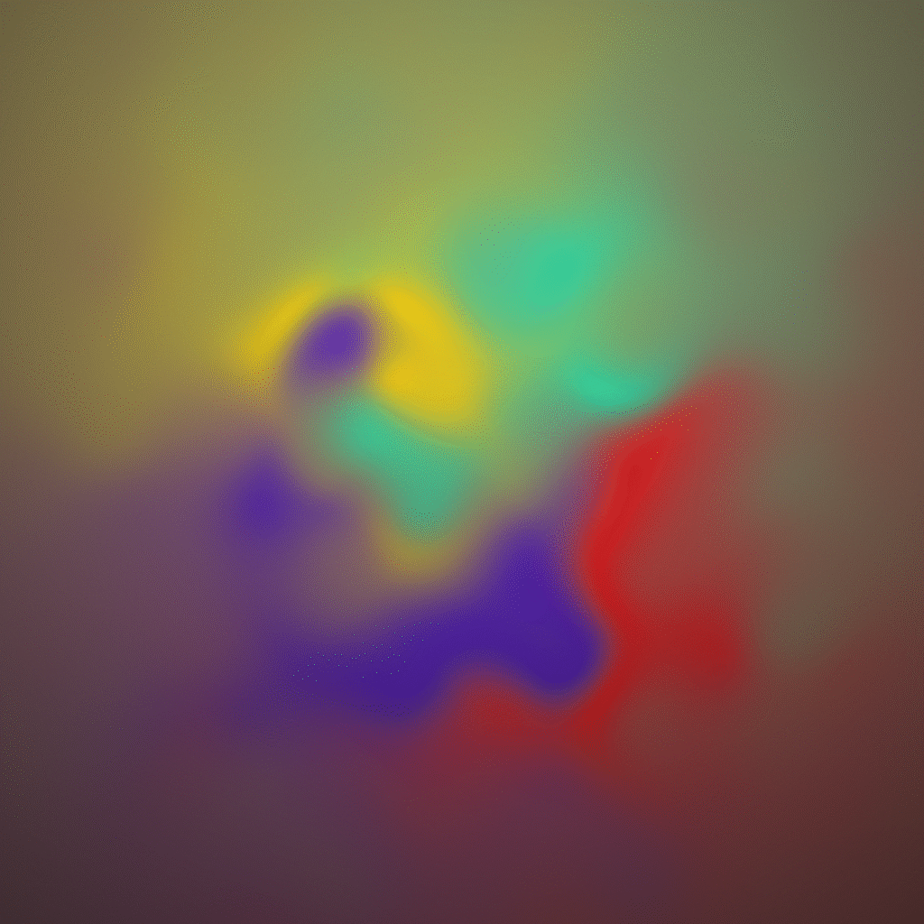
A 6-color palette was defined:
a. Psychedelic Green (#01ff4f)
b. Visionary Yellow (#ffeb00)
c. Surreal Teal (#00edf5)
d. Trippy Red (#fc0019)
e. Kaleidoscopic Pink (#ff01df)
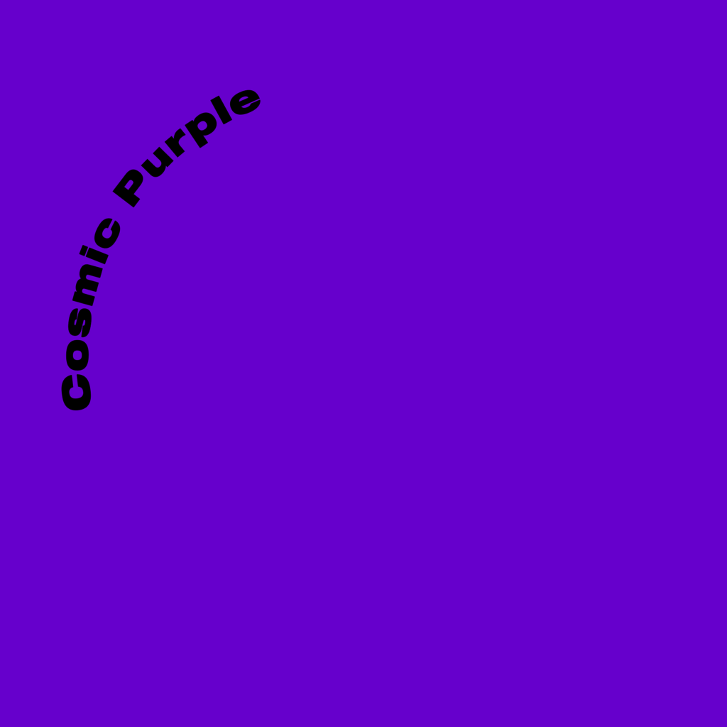
f. Cosmic Purple (#5600cc)
Instead of applying them statically, a dynamic approach was taken by combining 4 at a time (using combinatorial logic C(6,4)), then animating them in After Effects with turbulent displacement to create evolving, organic gradients.
This system palette allows the brand to express itself in multiple forms: animated gradients serve as moving backgrounds and digital visuals, while still frames from the same sequences provide static applications for print, posters, and social content. The result is a consistent yet ever-changing visual language — a living color system that mirrors the themes of transformation, consciousness, and collective rhythm at the heart of the Jungle Party.
Beyond their aesthetic role, these colors also carry a functional purpose: each tone can be assigned to visually represent different areas and experiences within the event — for example, Jungle Talks, the Networking Zone, the Art Gallery, Workshop spaces, and the Dancefloor. This ensures that the palette not only conveys atmosphere but also serves as a clear guide, enhancing wayfinding.

Branding
5. Typeface
The Jungle Party typography is built on a single extended black, neutral sans-serif font, chosen for its clarity, strength, and versatility.
To adapt across posters, print, digital, and UI, a proportional system based on the Golden Ratio (φ) and Fibonacci sequence mixed with other Prime Numbers, ensures natural hierarchy and balance between titles, subheaders, and body text. Body text follows a base rule of font-size: 1rem; with generous spacing for readability, while titles use reduced spacing for stronger visual impact. Paragraphs using body paragraphs usually are justified.
Text is primarily set in Pitch Black (#000000) to anchor content against the vibrant, shifting gradients of the color system, balancing expressive energy with typographic order.
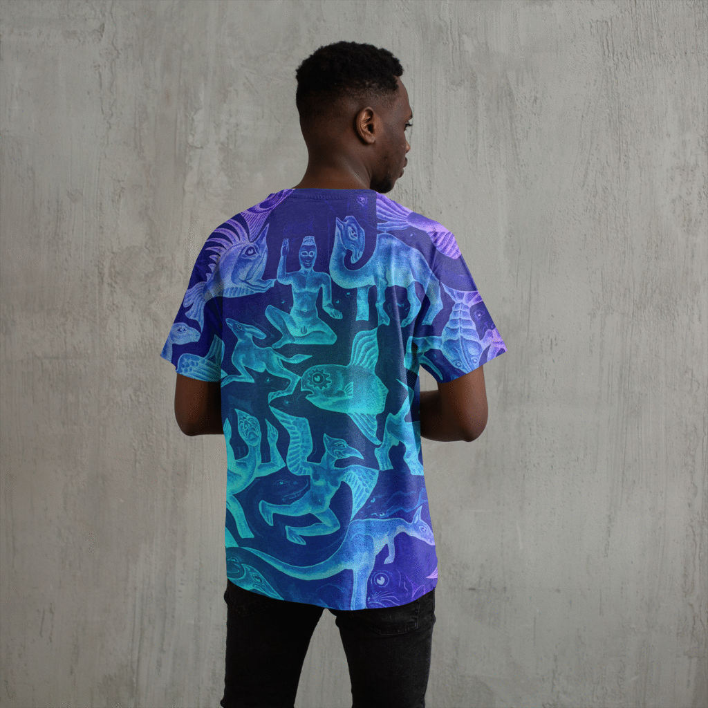
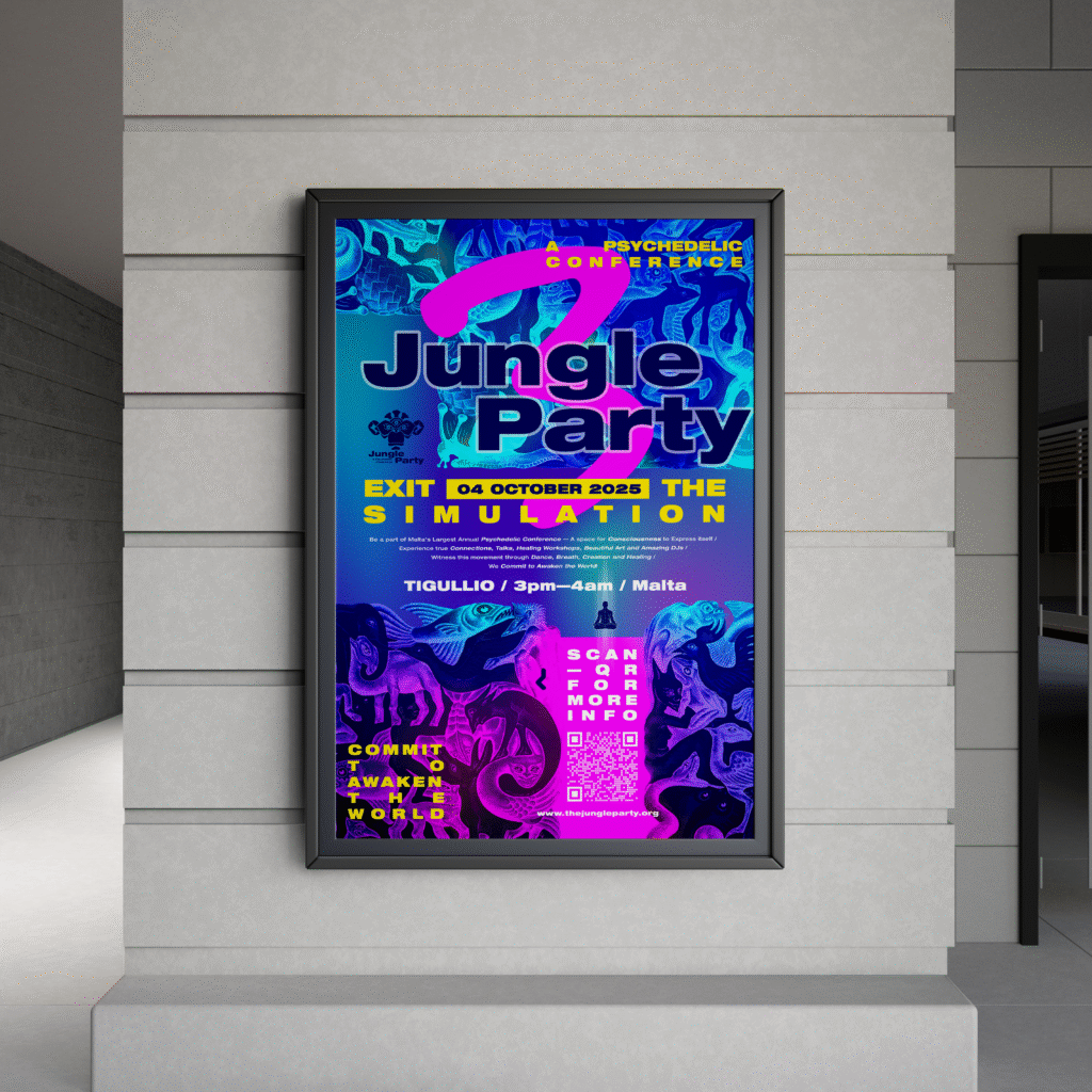

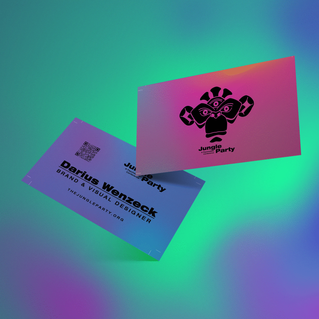

Graphic Design
6. Print Products